Bnoon - Brand & Identity
Client
Bnoon Branding & Identity
Services
Brand & Identity
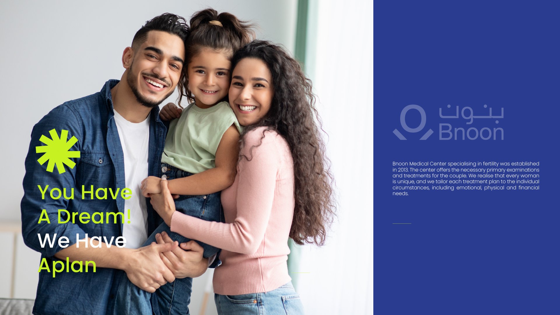
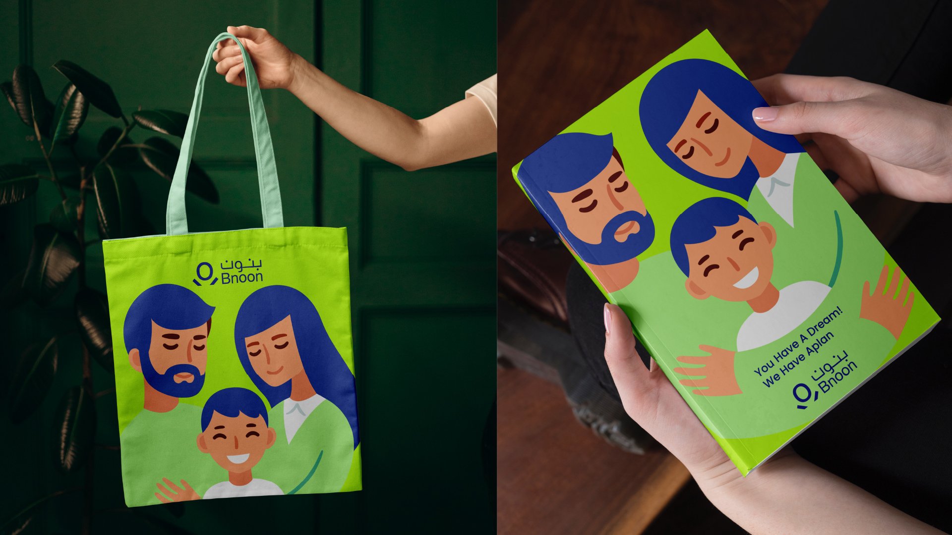
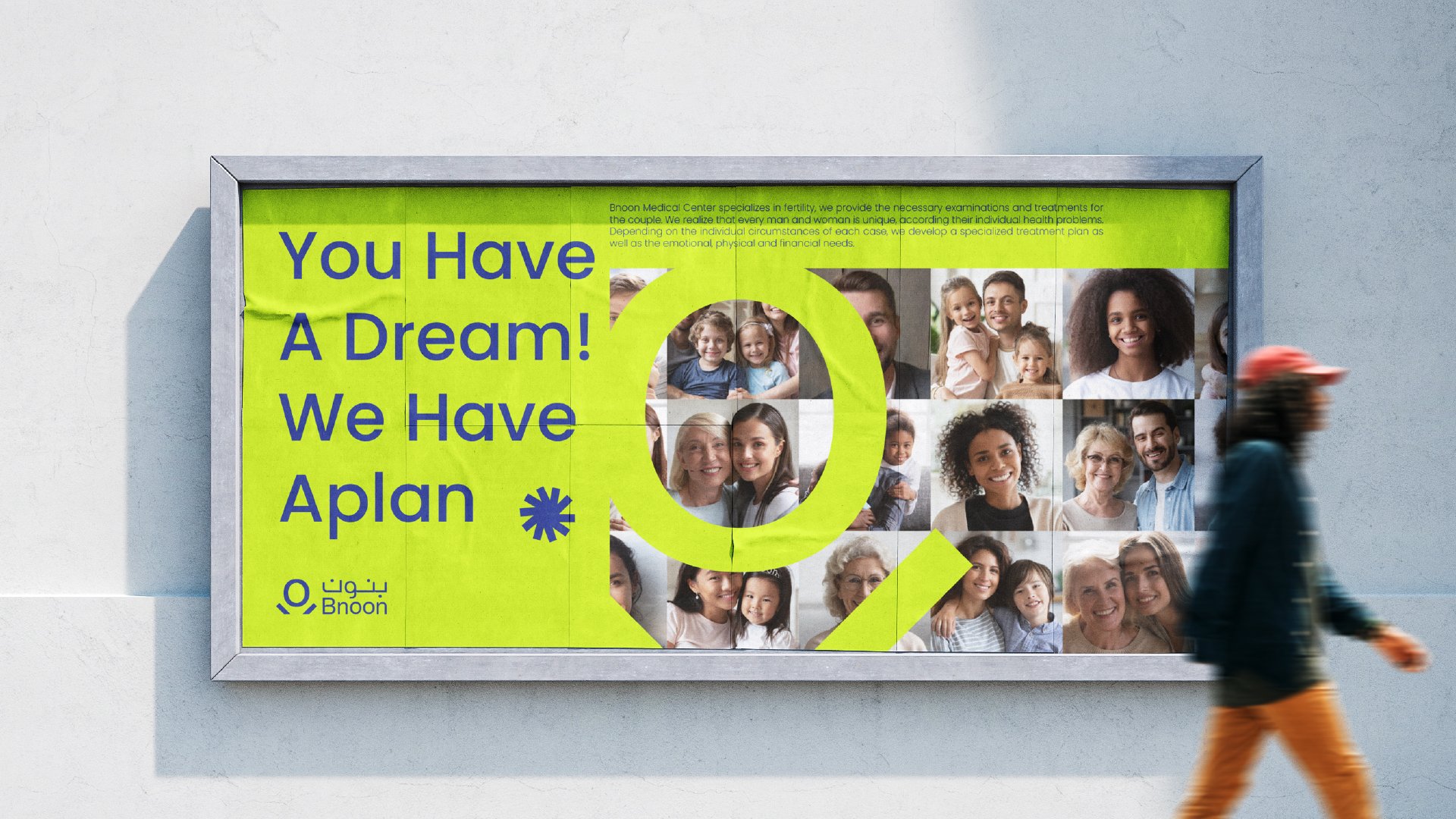
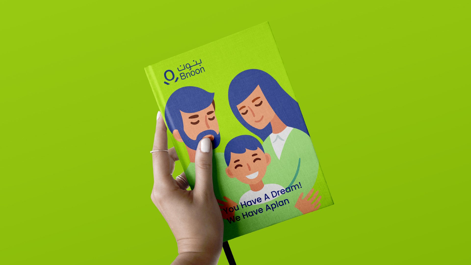
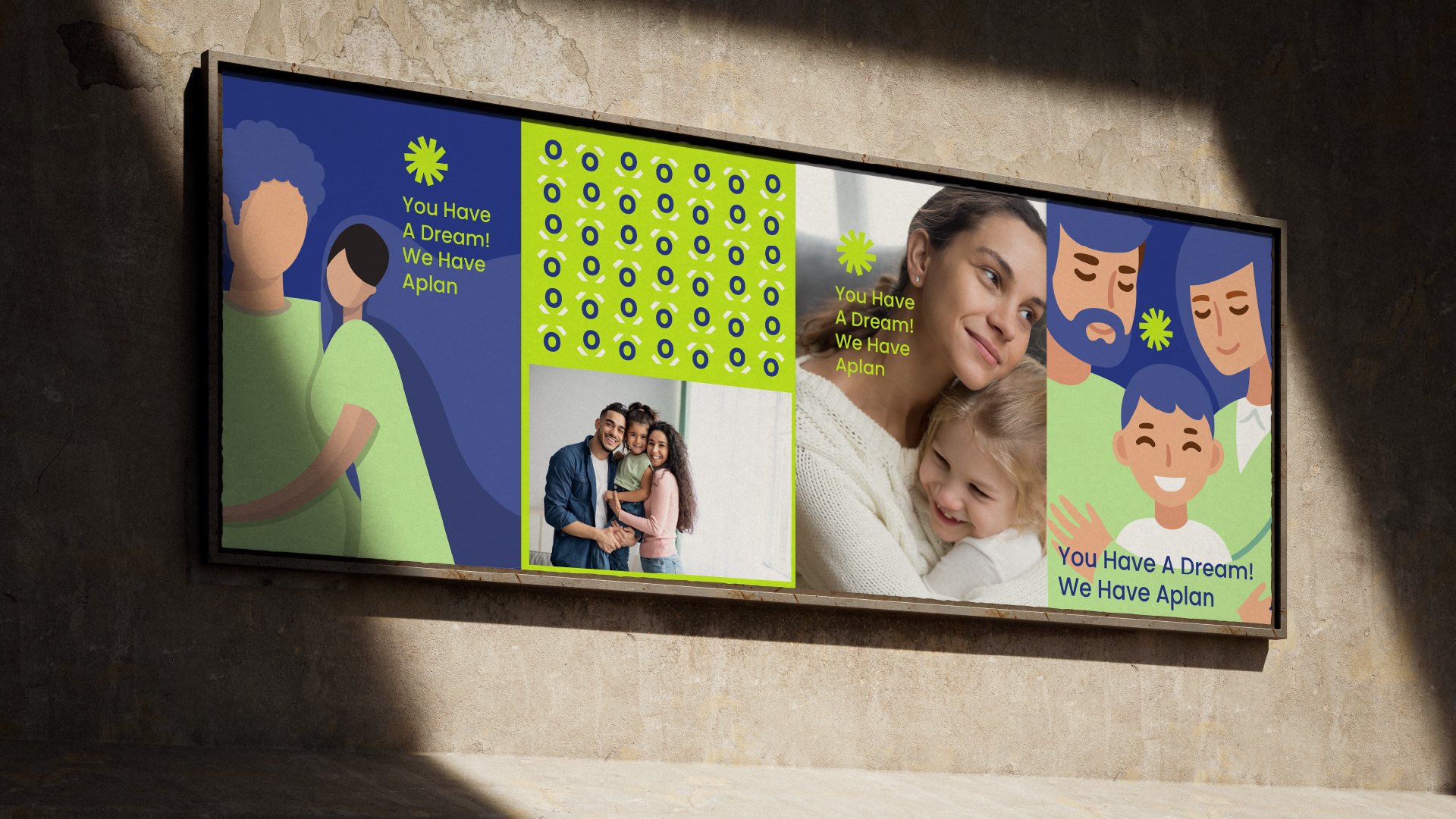
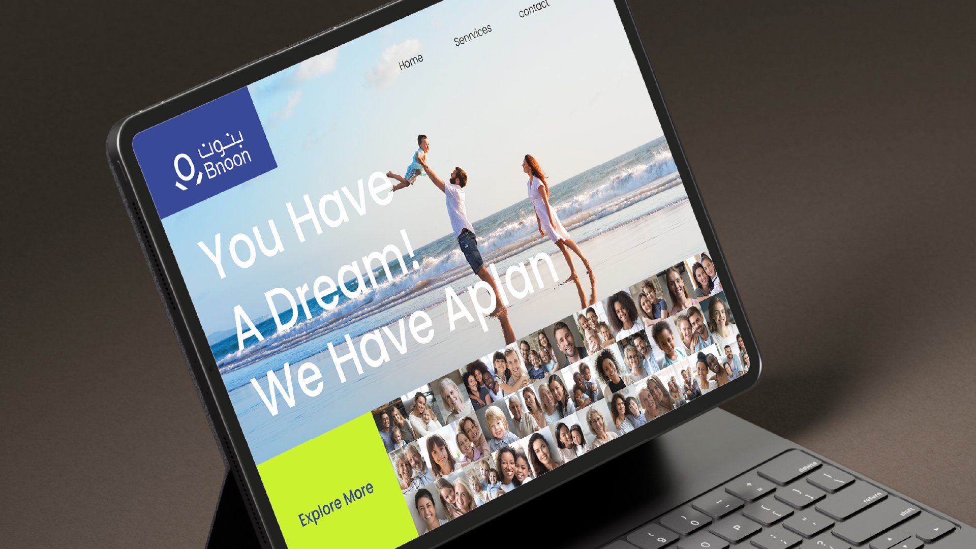
We designed the brand's identity around a symbol that is like a child, representing the miracle of childbirth in a way that is both easily recognizable and dynamic. This symbol serves as the brand's heart, conveying the essence of new life with simplicity and clarity.
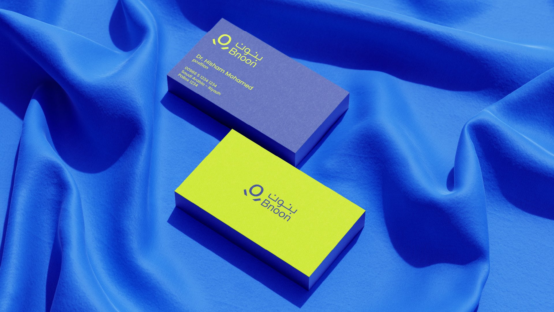
To complement this, we applied the brand's identity seamlessly across all touchpoints, choosing vibrant, radiant colors that evoke feelings of hope and renewal. These colors not only reflect the optimism associated with new beginnings but also symbolize the healing and recovery process, reinforcing the brand's commitment to supporting families through every step of their journey