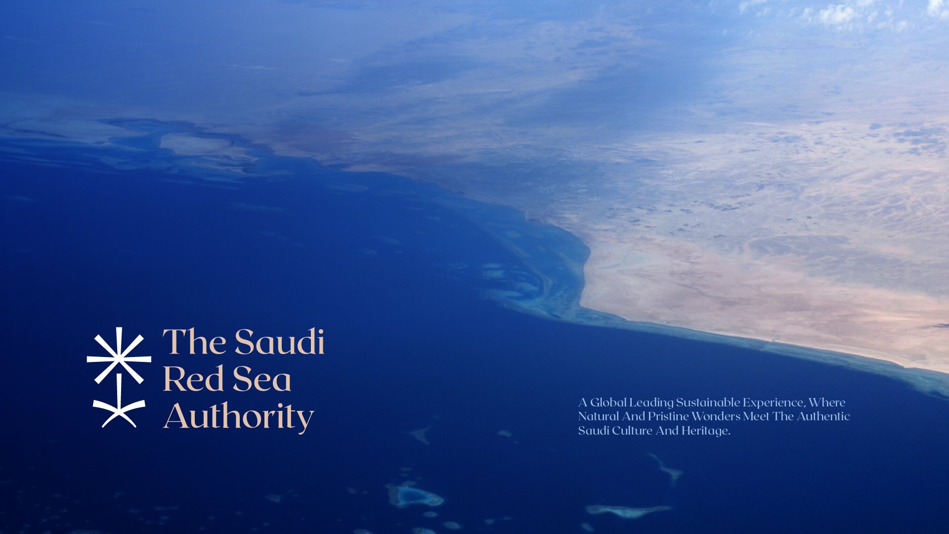
Saudi Red Sea
Client
The Red Sea
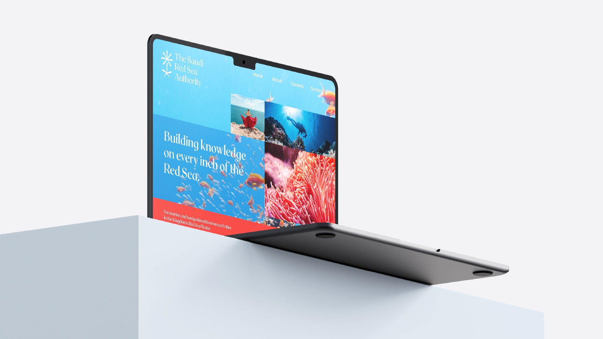
Services
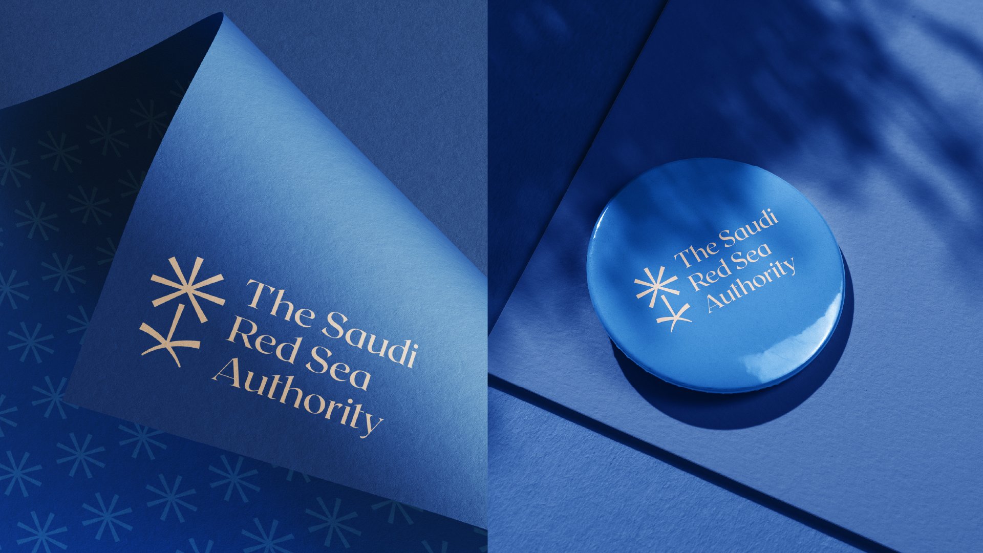
Brand & Identity
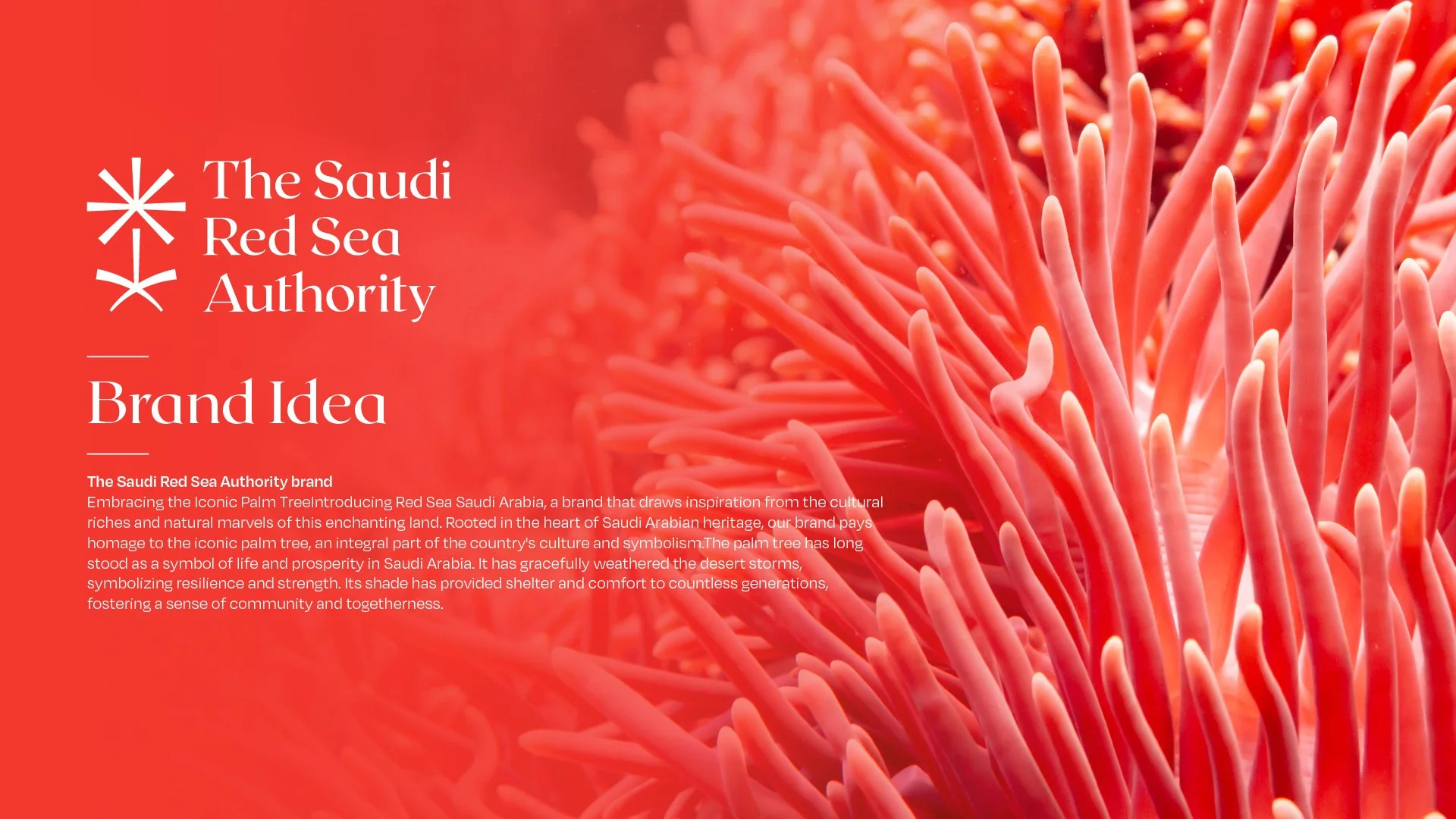
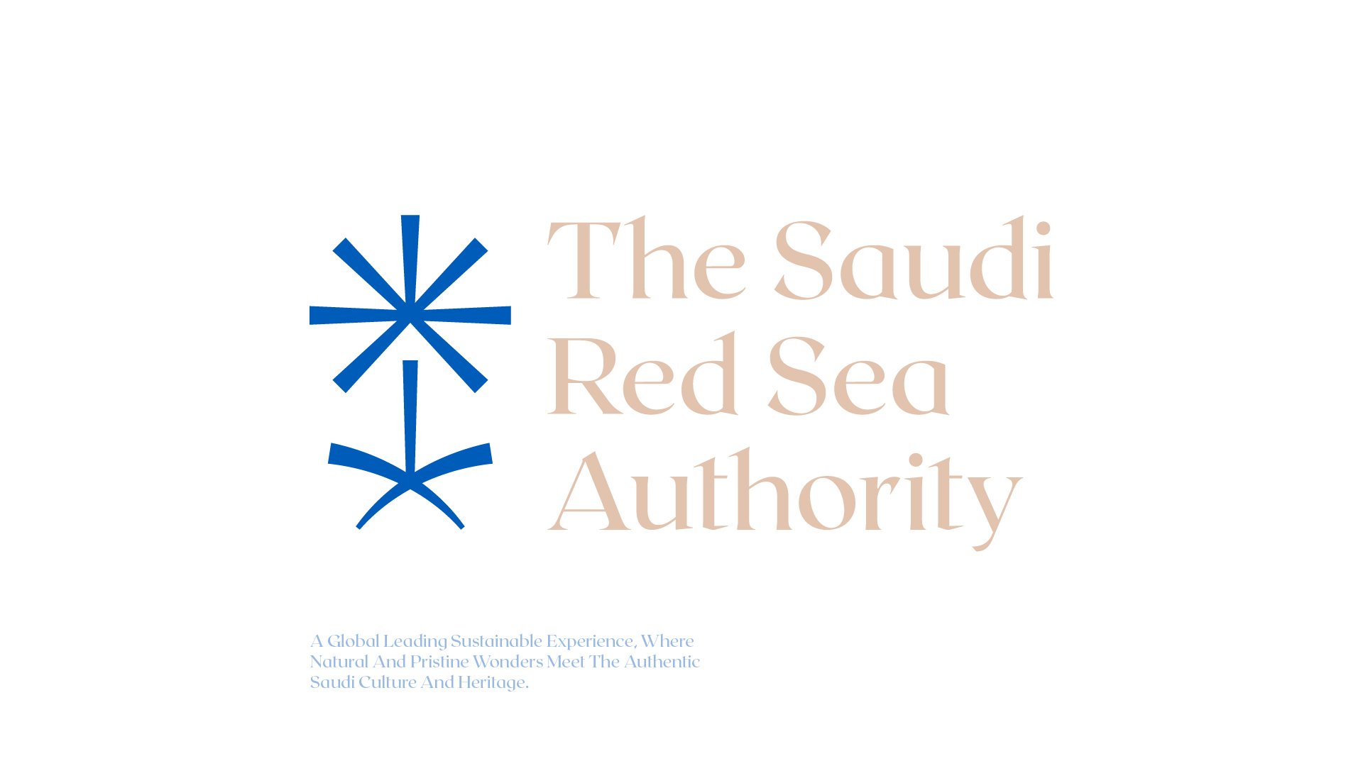
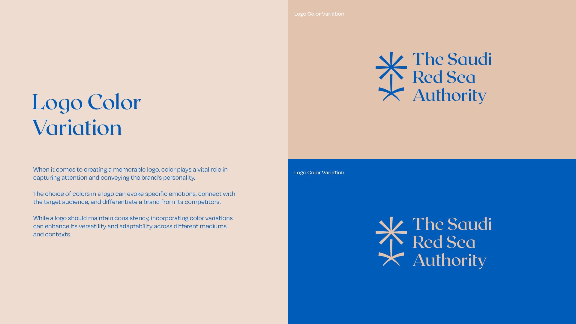
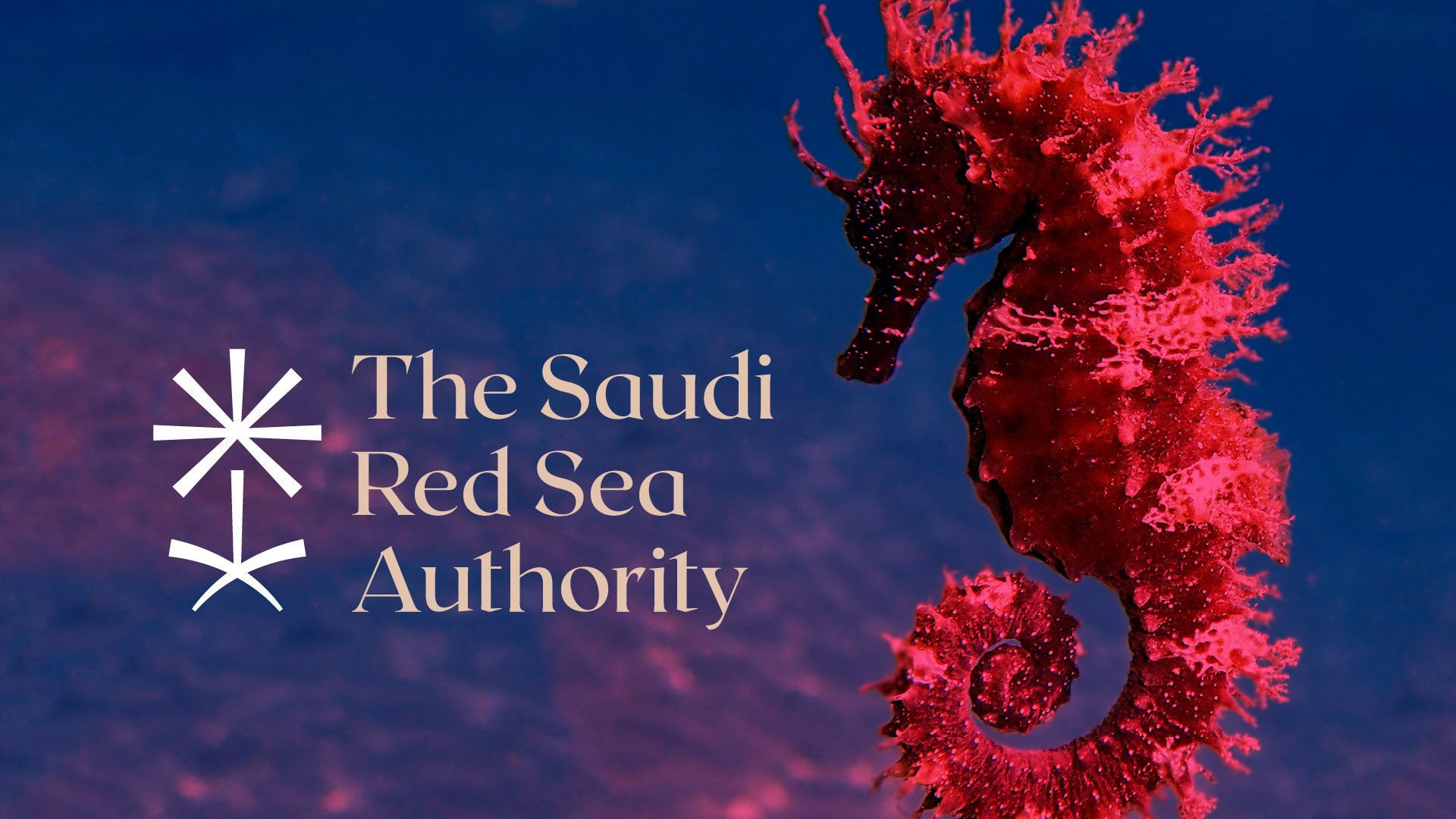
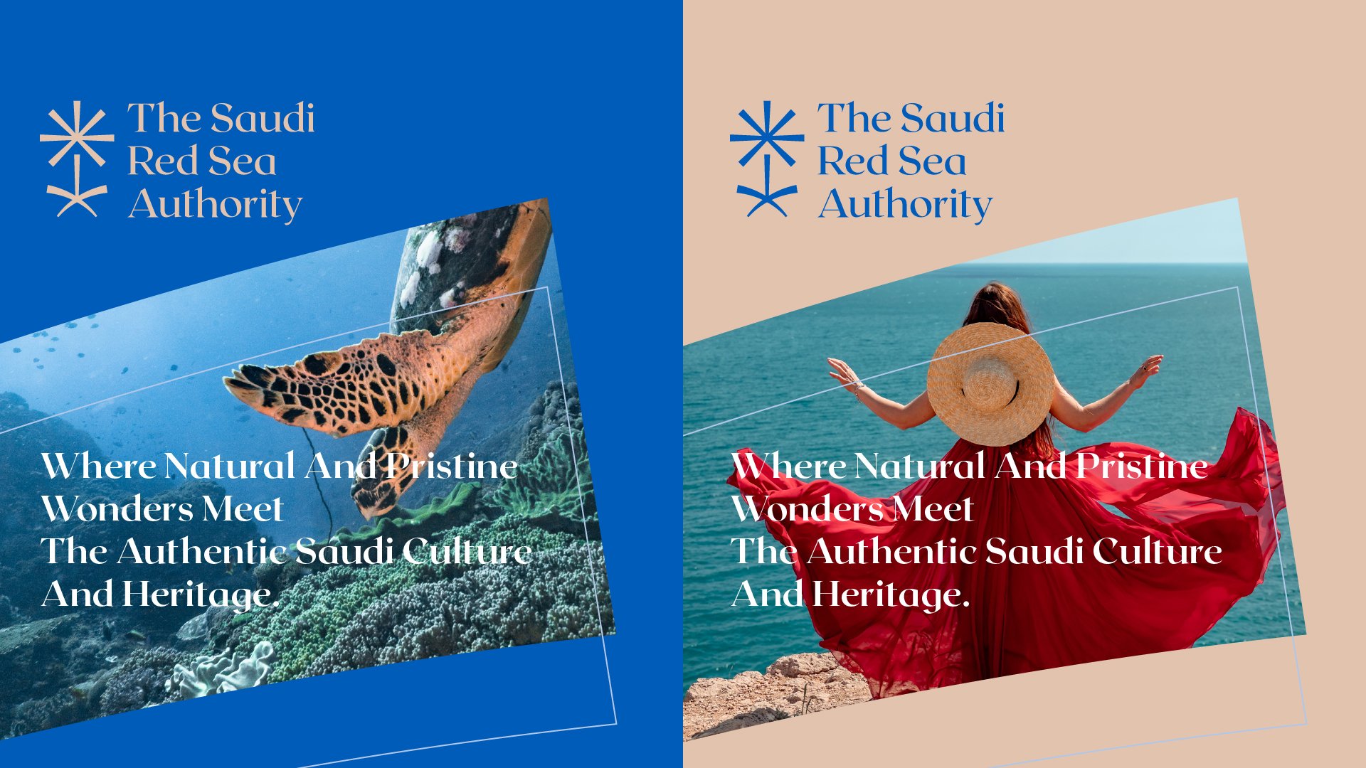
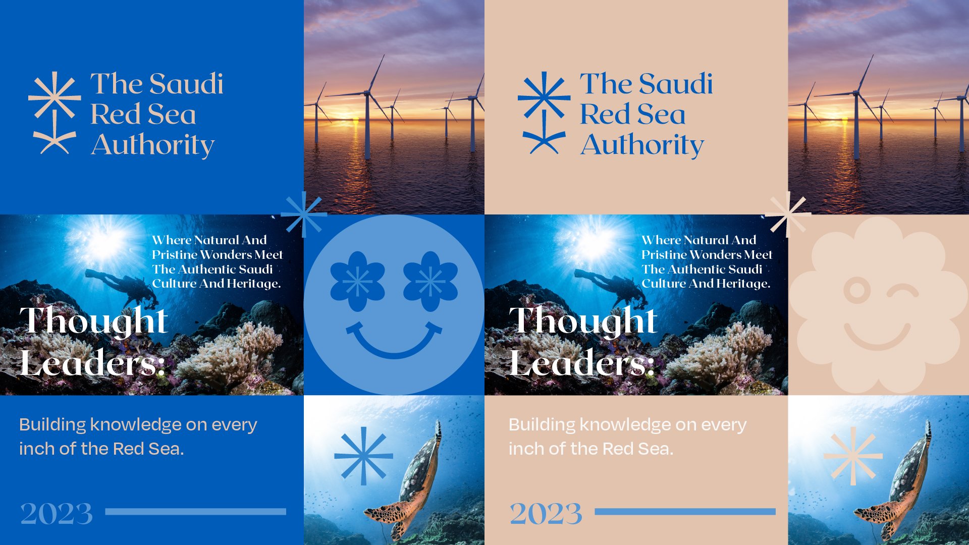
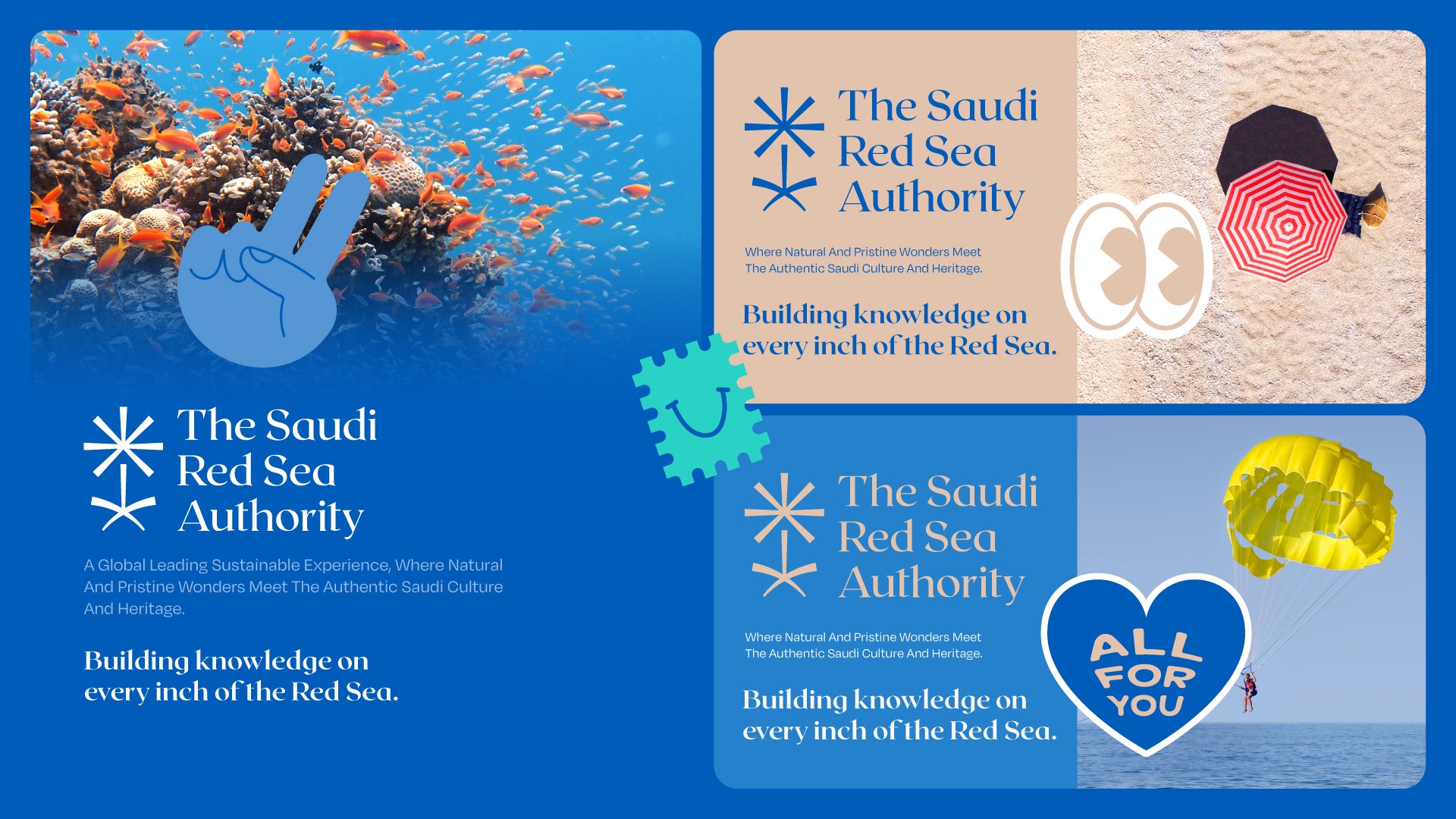
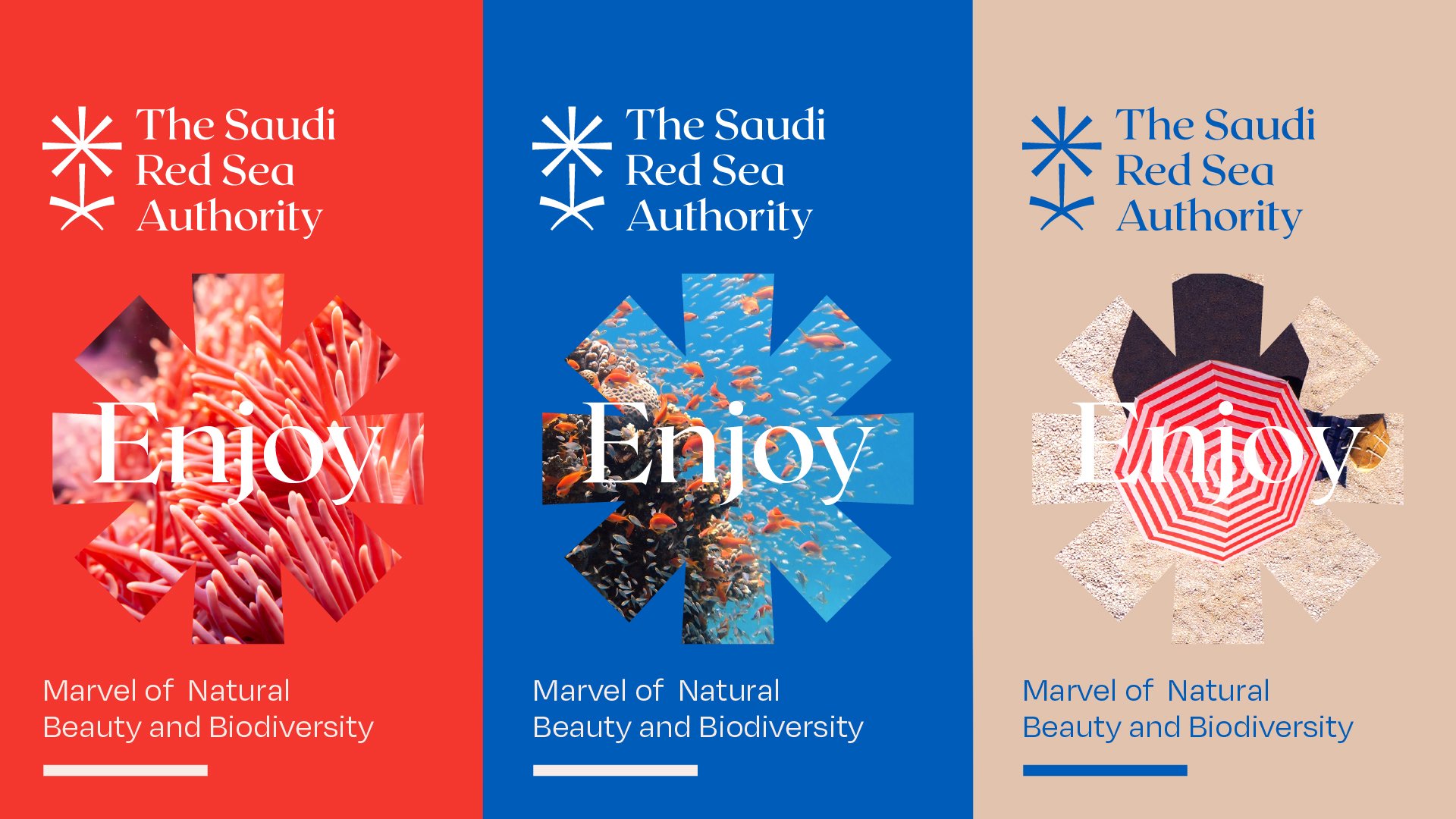
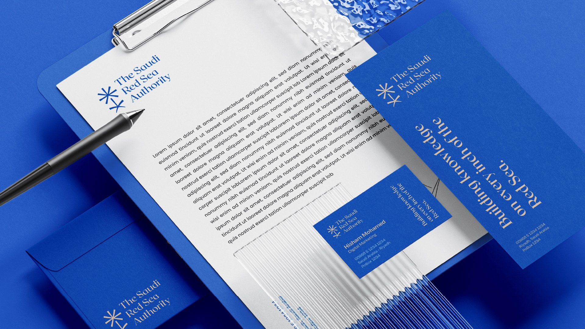
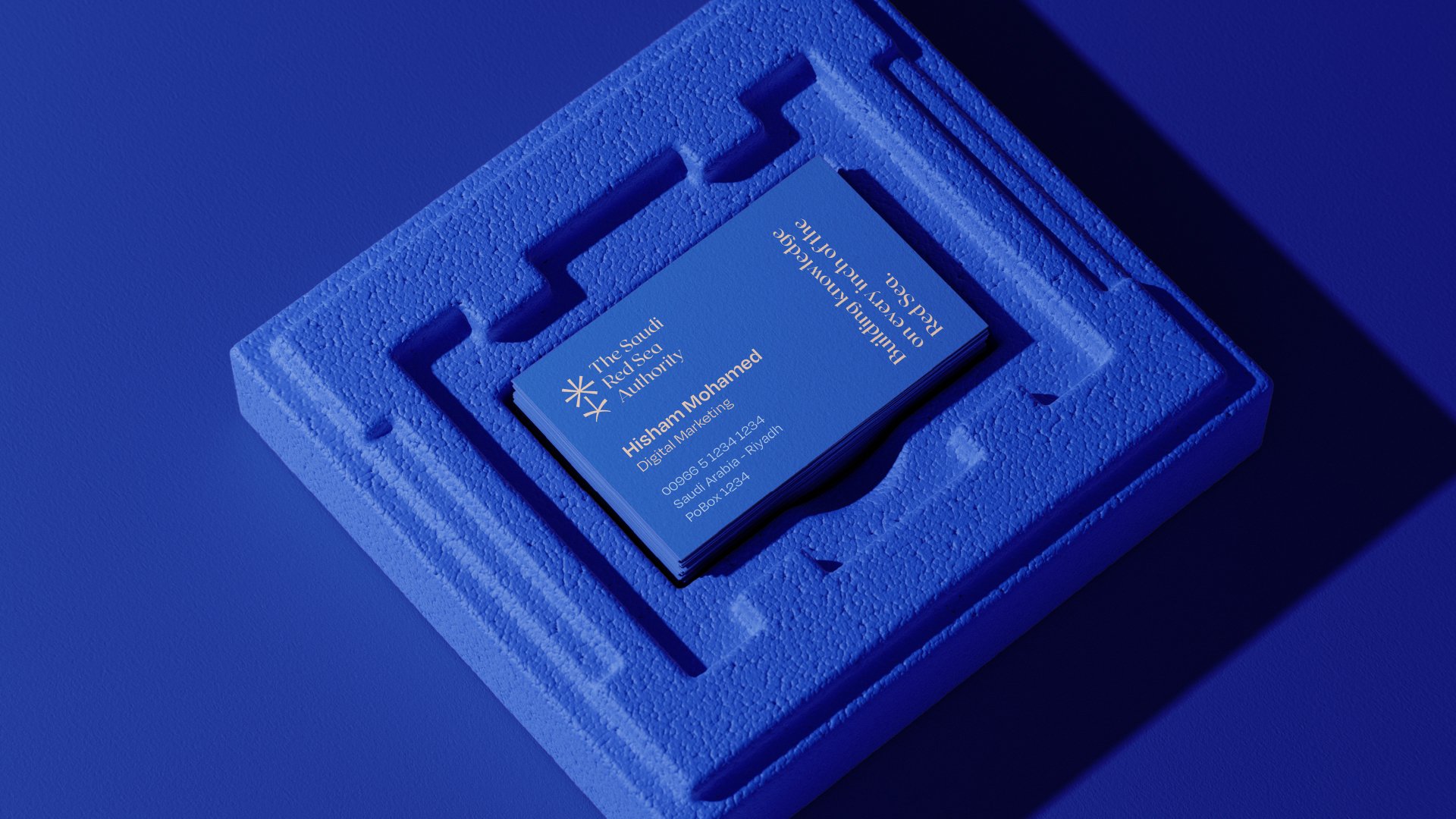
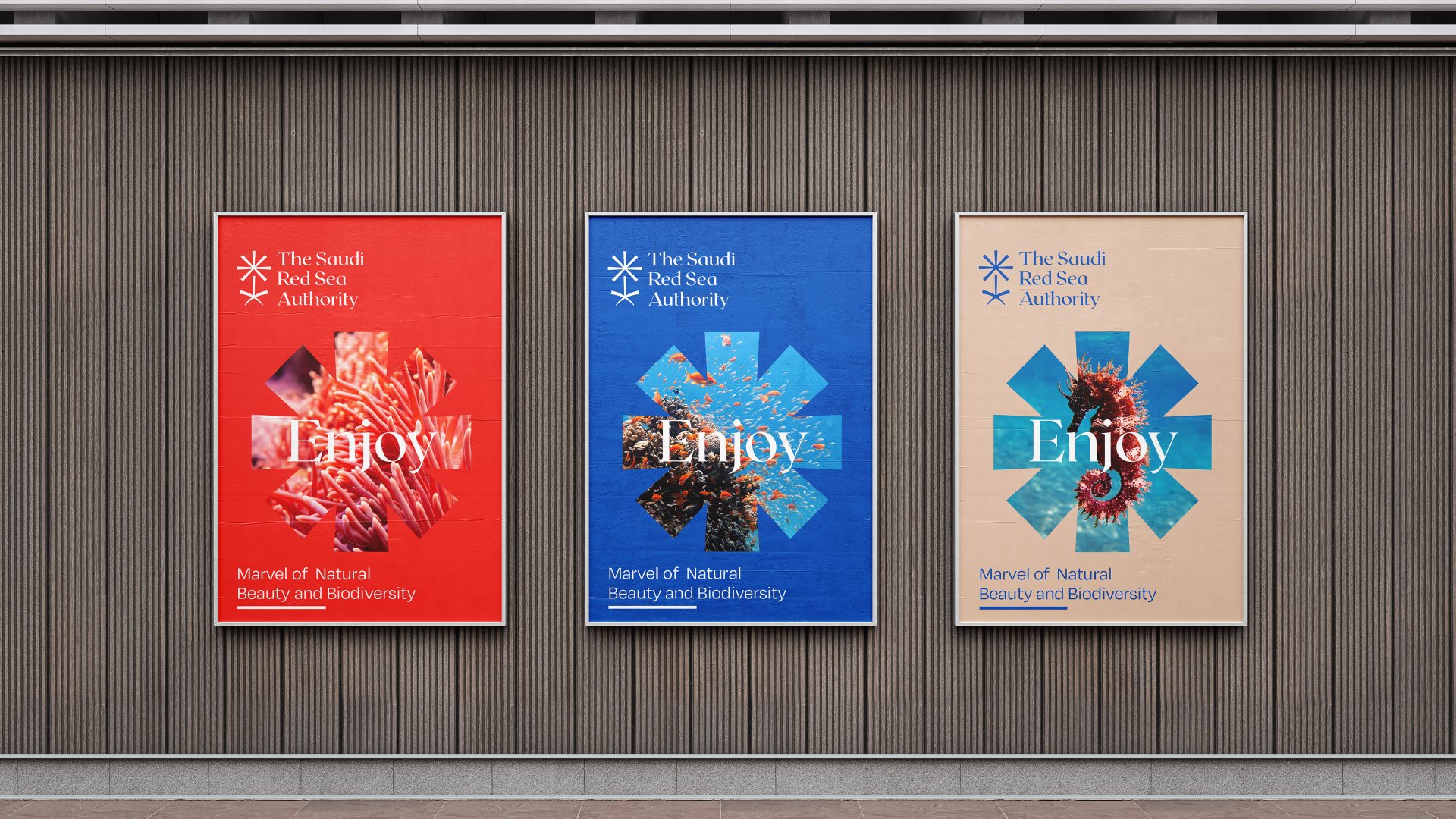
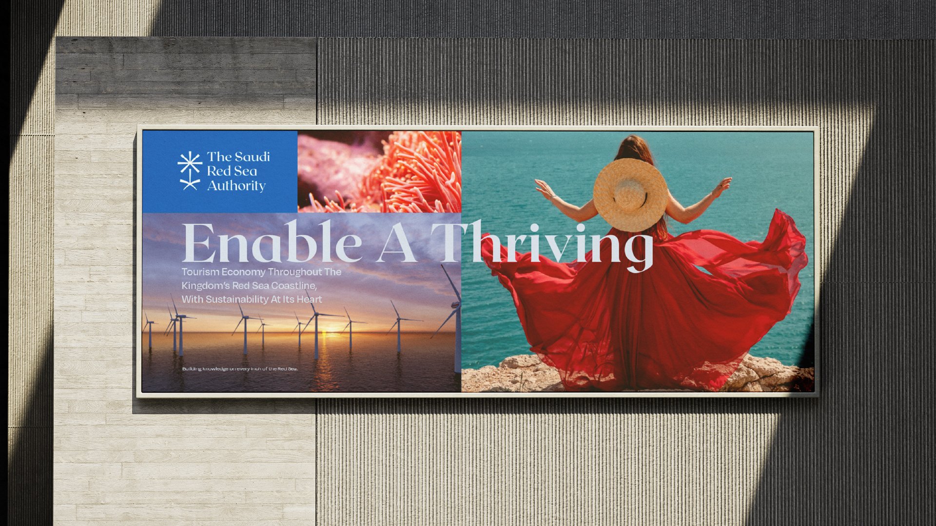
The inspiration for this logo comes from the iconic Saudi palm tree, creatively integrated with the name of the authority to achieve a harmonious and meaningful design. The palm tree serves as a central element, reflecting the cultural and natural heritage of Saudi Arabia.
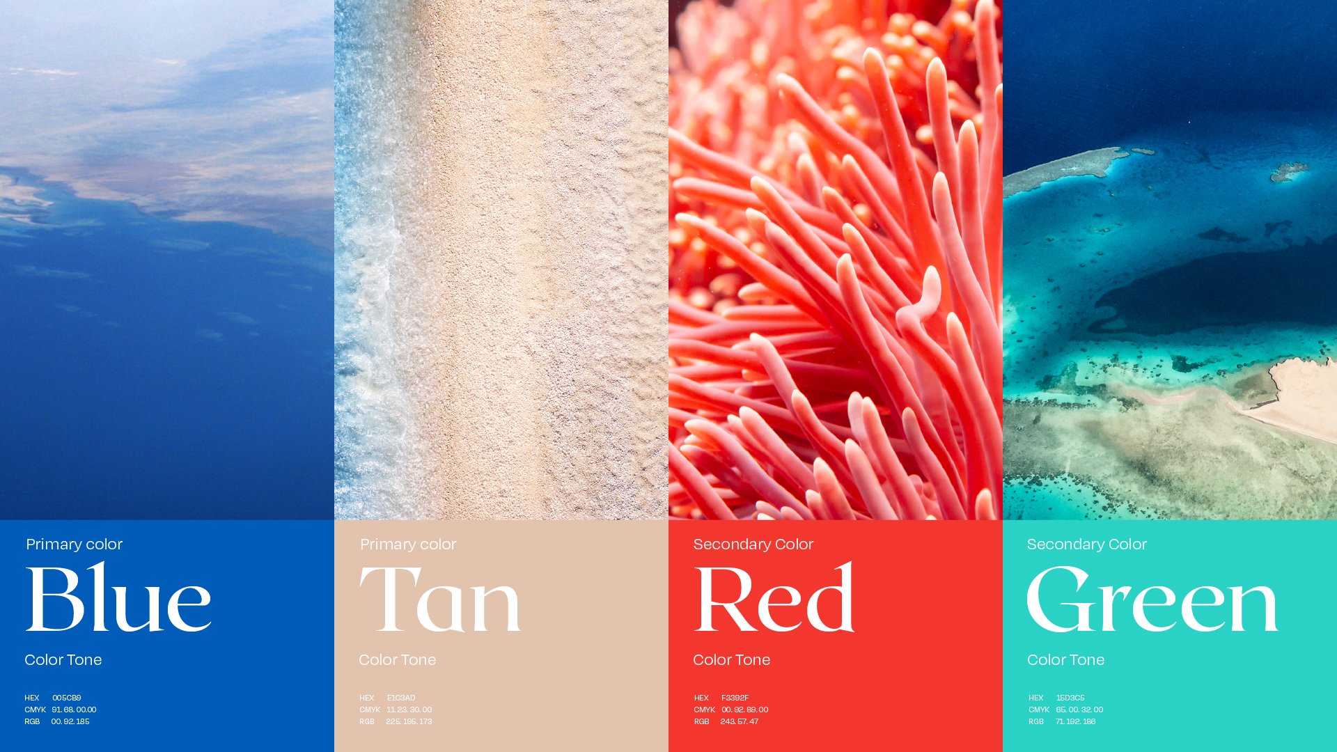
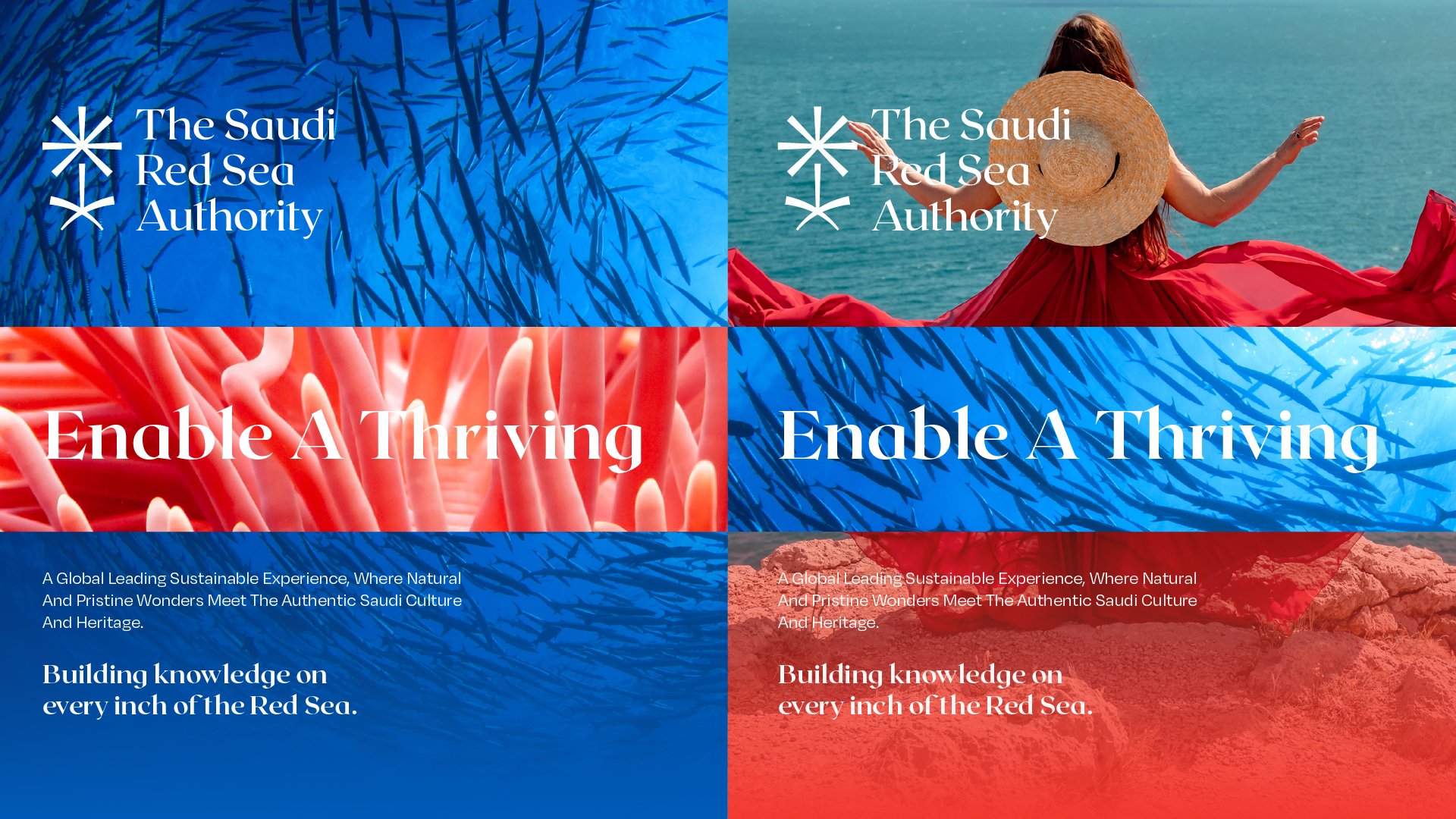
In designing the brand identity, we carefully selected colors that resonate with the surrounding environment. The blue represents the vastness and depth of the sea, while the red captures the vibrant hues of the coral reefs. To balance these tones, we chose a neutral light brown, symbolizing the stability and grounding of the land. This thoughtful combination of colors not only reflects the natural beauty of the region but also creates a cohesive and visually appealing identity